
Syn+ergasia
A jobs & skills fair, rebuilt as a public invitation — because work is something people only ever make together.
naming · identity · campaign system
print · signage · motion
the name
syn — together.
ergasia — work.
Two Greek words held together by a plus. σύν, with; εργασία, work. Set as one lowercase word, the plus stops being decoration and becomes a joint — the exact point where a person meets an employer, a skill meets a vacancy, a classroom meets a factory floor.
That joint is the whole campaign. Every layout is two things pushed against each other and locked: two colours, two type sizes, a name and a job. Nothing on the page is allowed to float free of something else.






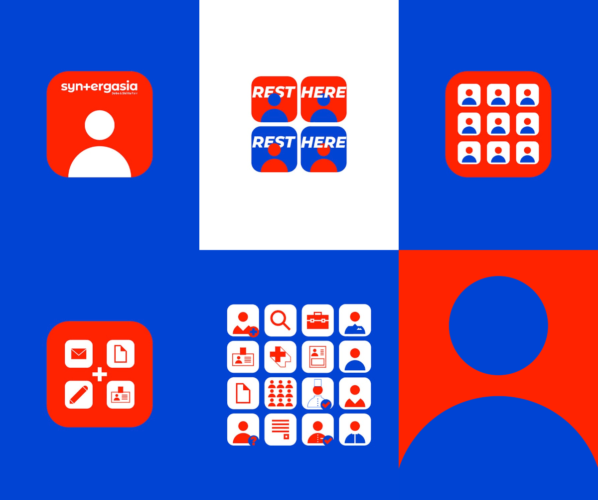

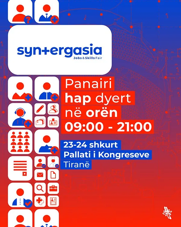


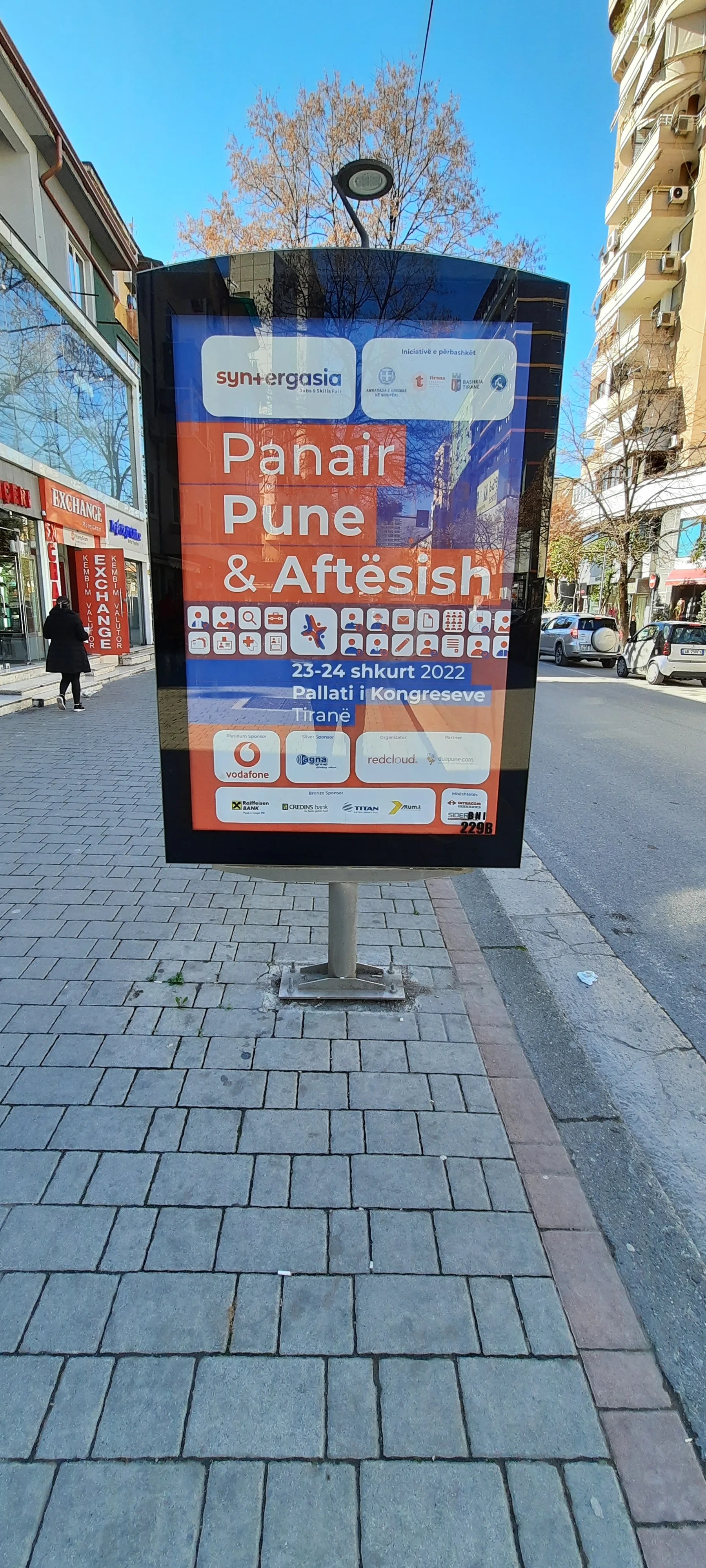
the system
Two colours.
No hierarchy between them.
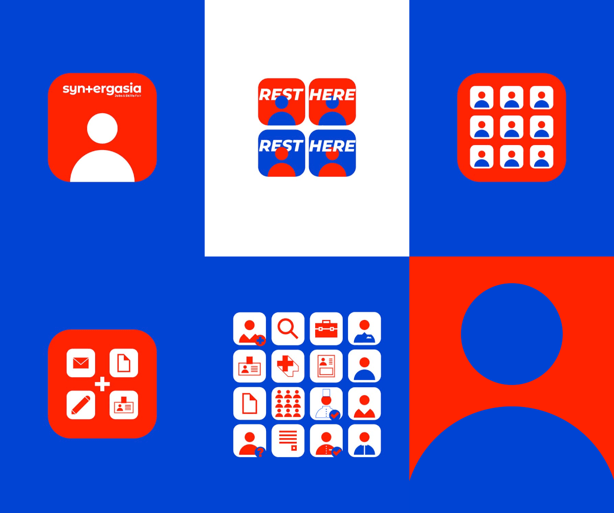
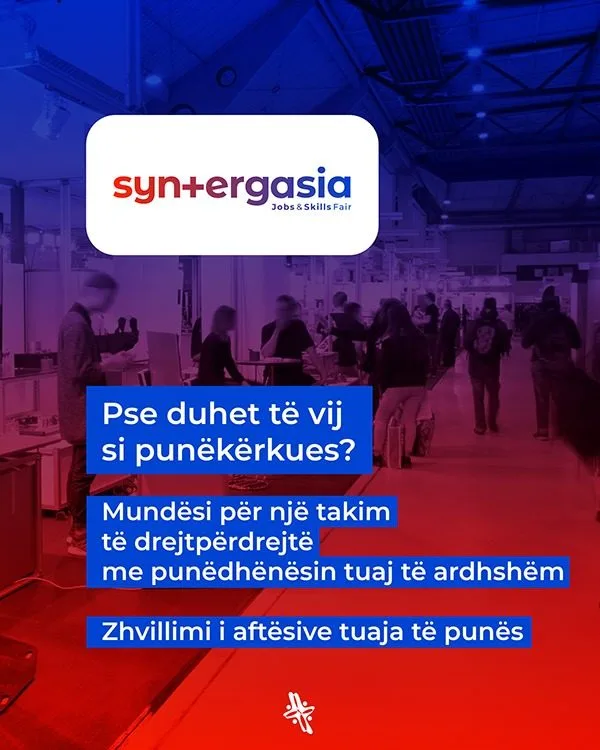
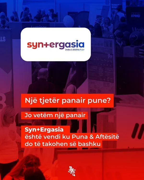
Ultramarine and signal red sit at equal strength — neither is a background for the other. A surface picks one and commits; the second colour arrives only as type or icon laid over it. White is the third colour, used as space rather than as paper.
Type is a single grotesque, tight and set large, so a job title reads from the far side of a hall. A mono voice carries the small print: hall numbers, hours, sector codes, the vacancy count. The two never mix inside one line.
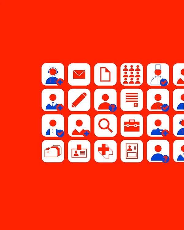
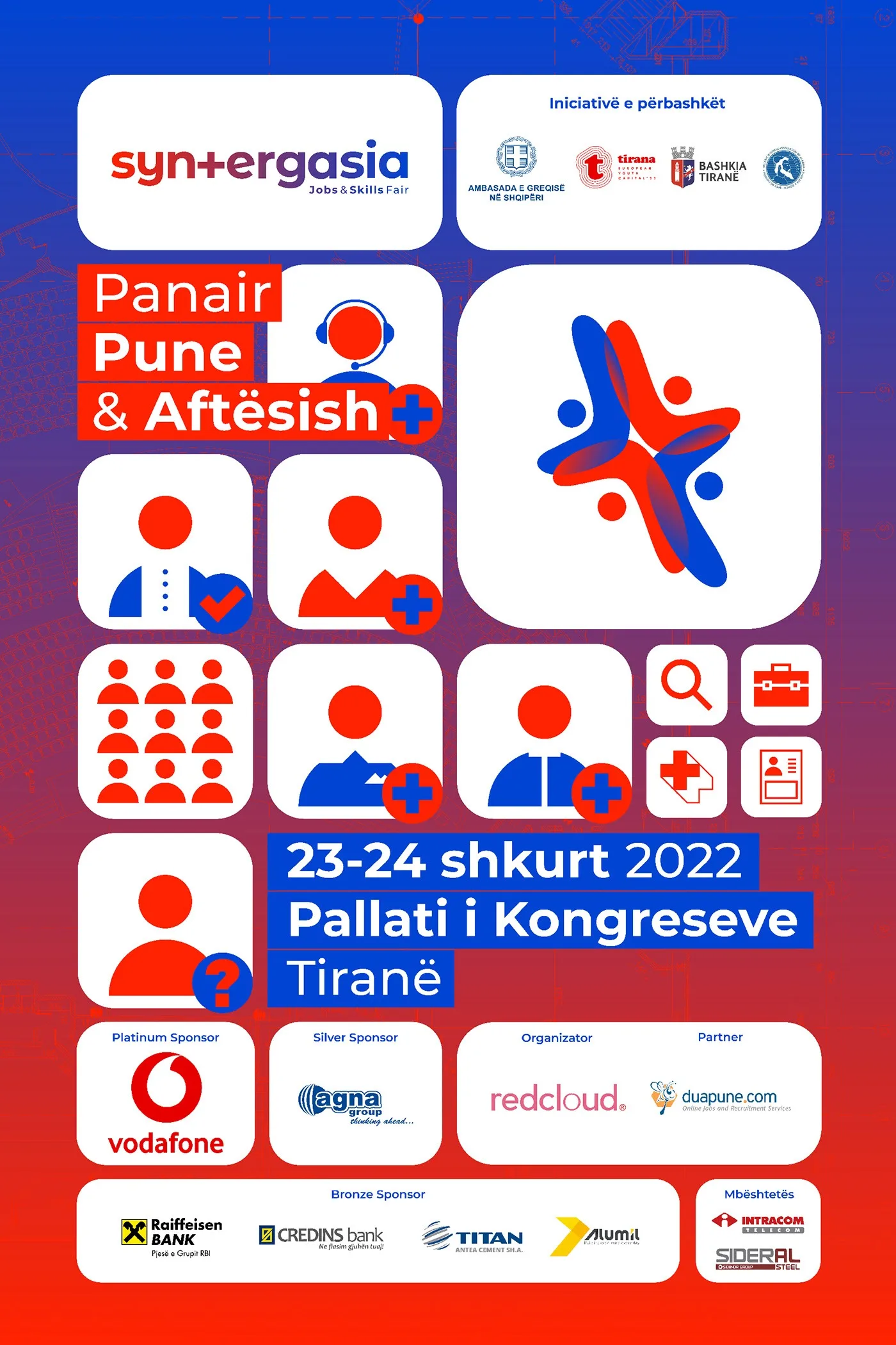
Icons are drawn on the same grid as the plus — one stroke weight, right angles and 45° only, no rounded corners. One glyph per sector means a visitor can navigate the fair before reading a single word of the programme.
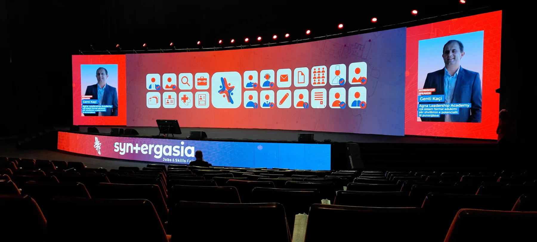


















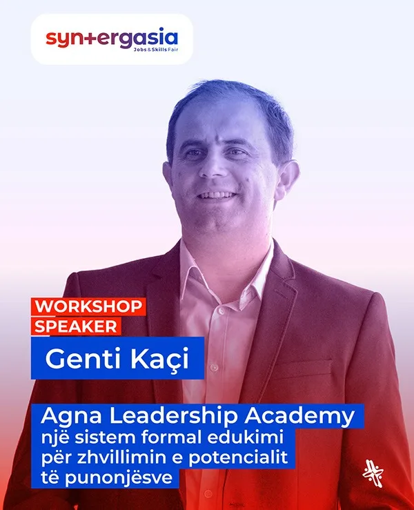


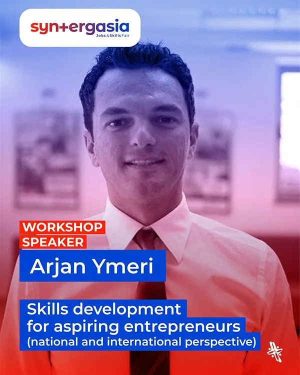


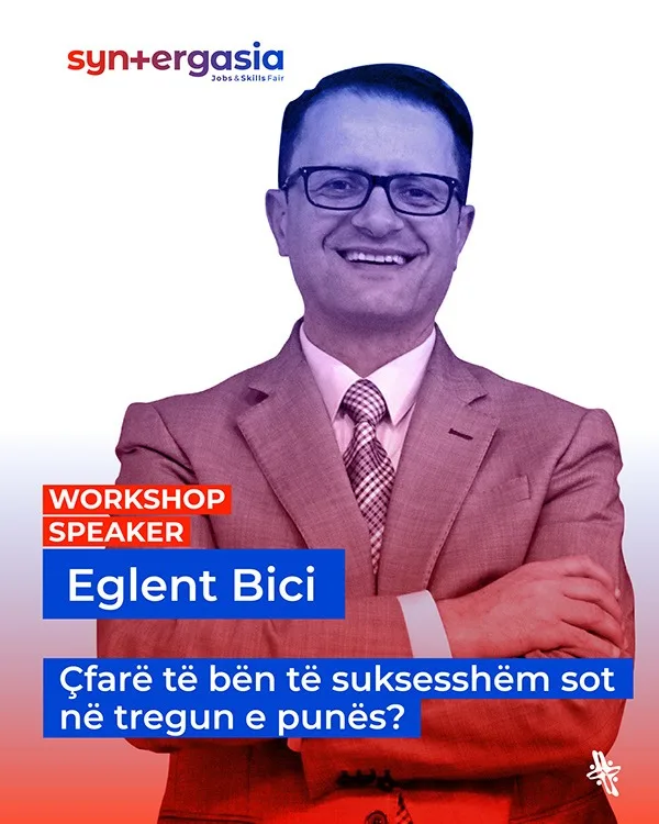

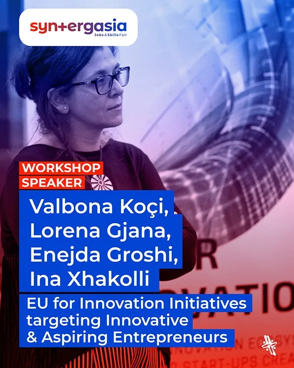


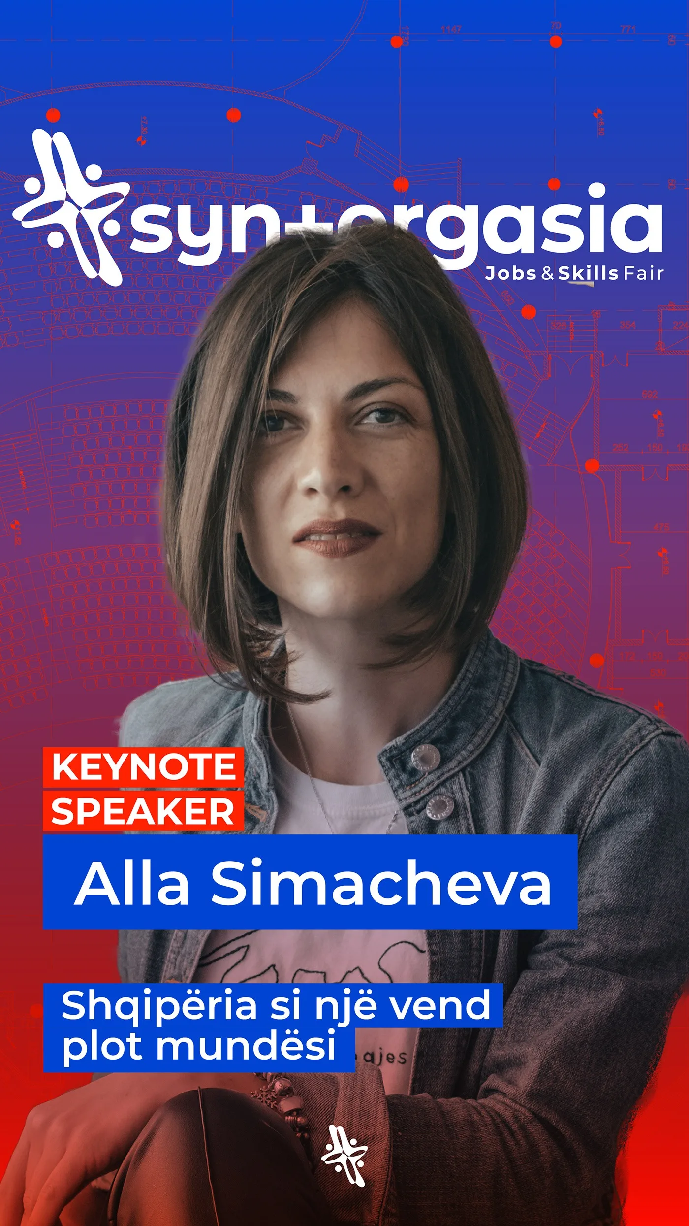
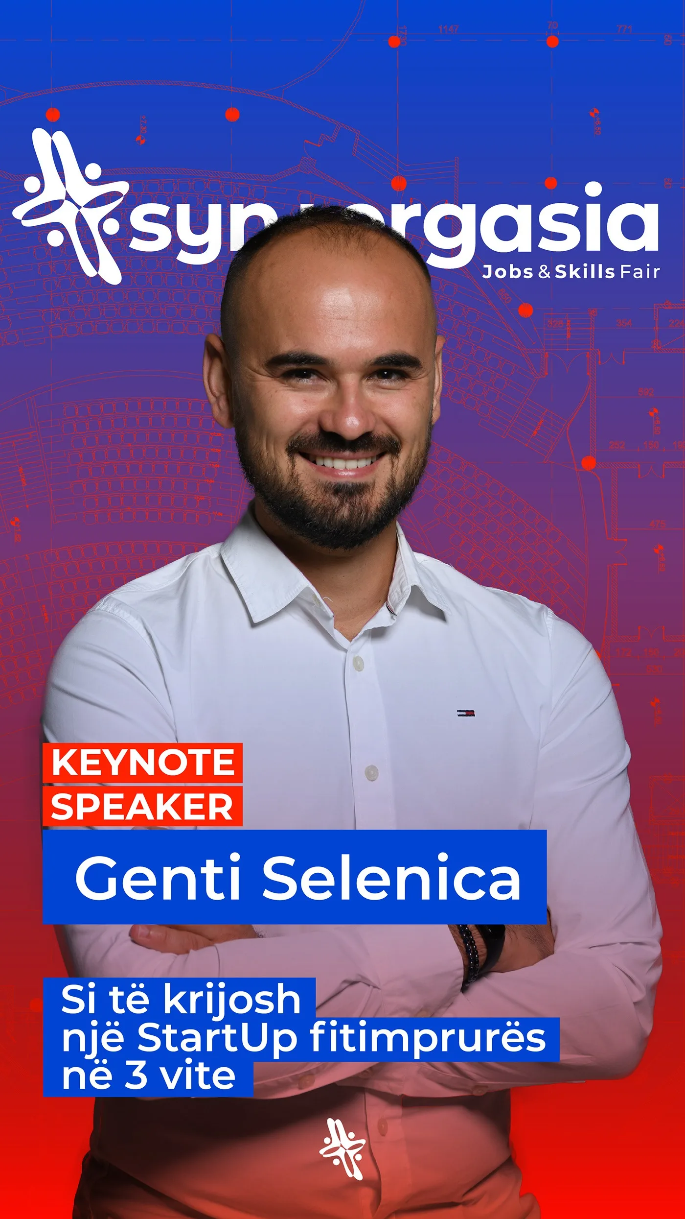

the event
The identity had to work at three metres and at three hundred pixels.
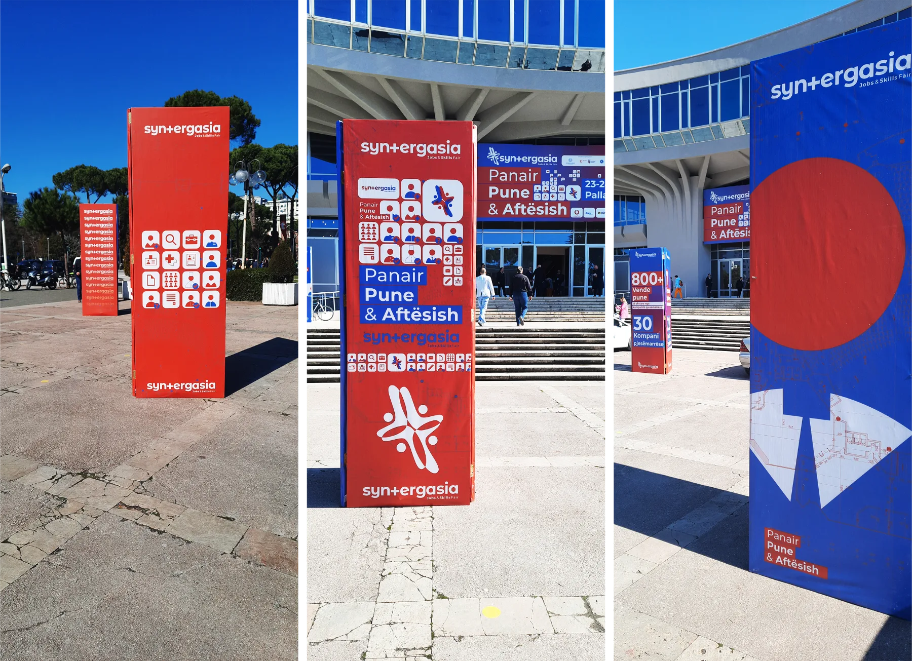
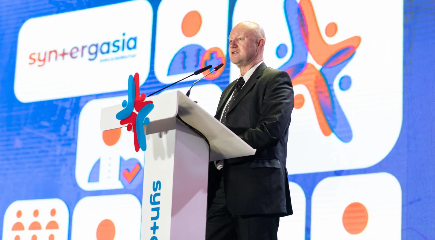
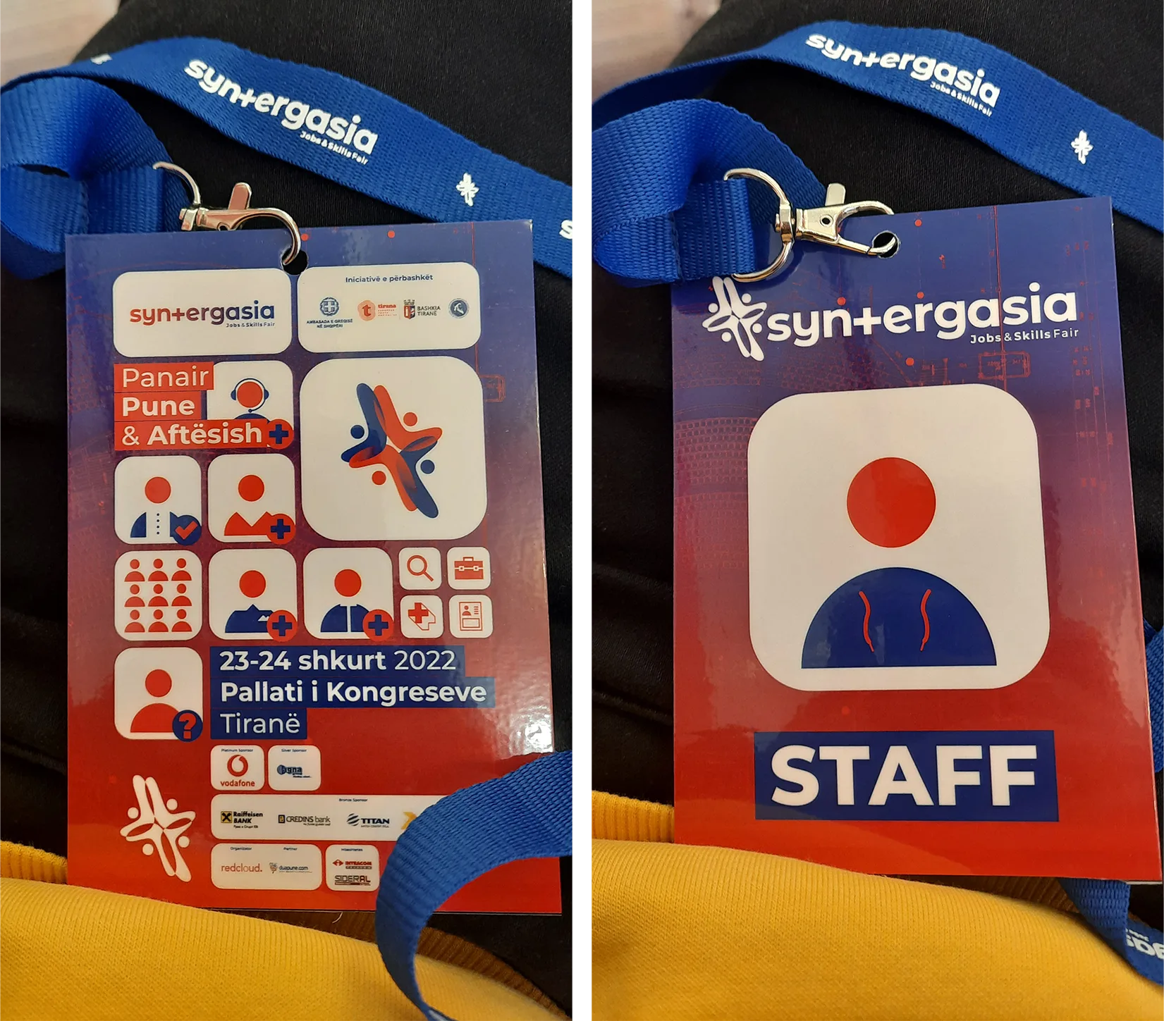
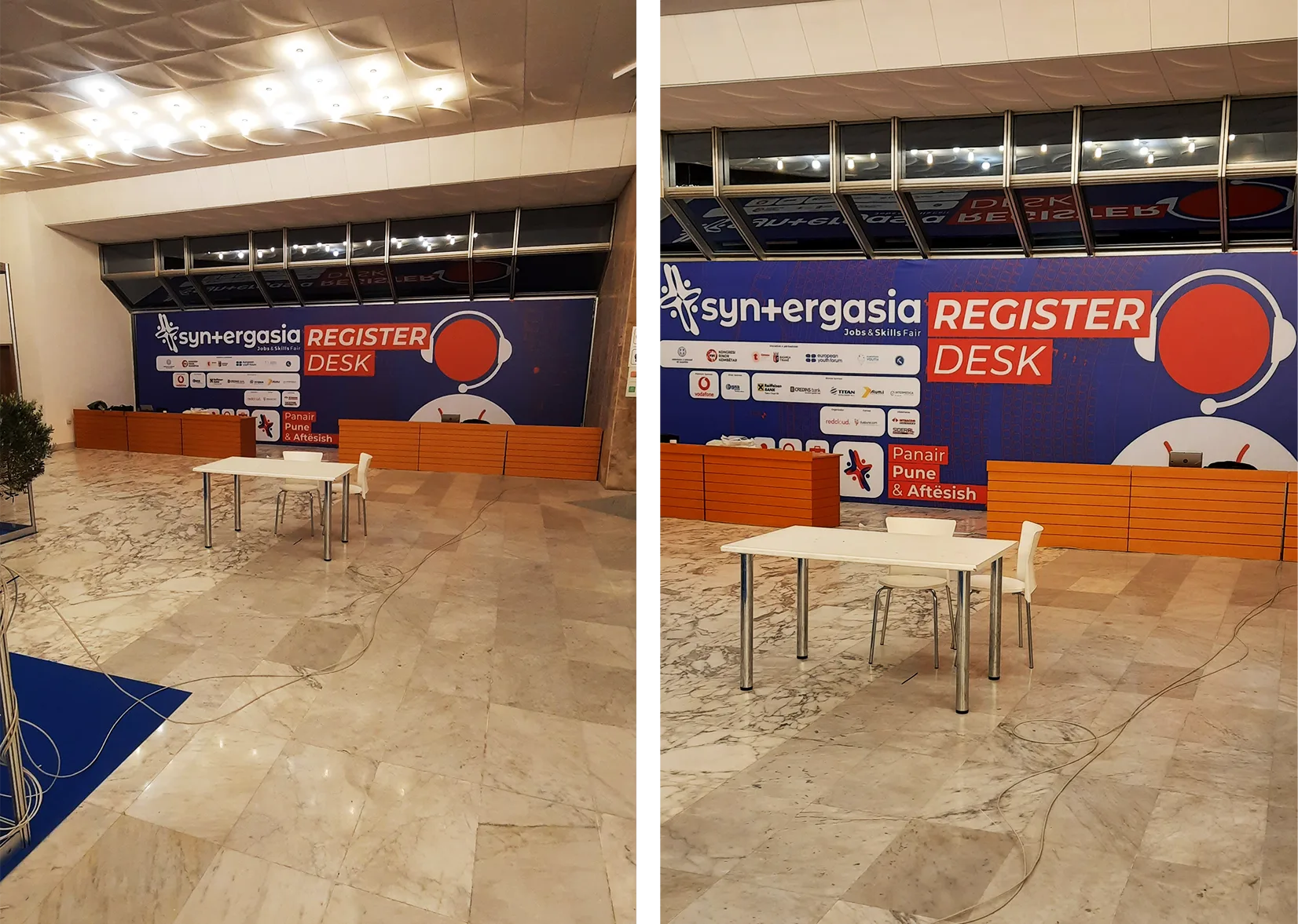
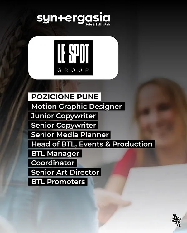
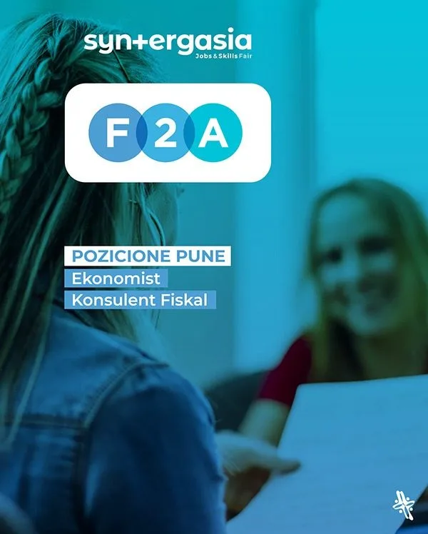
On the day the system becomes architecture: a red backdrop behind the stage, blue sector totems over each hall, employer cards clipped to every table, and a printed announcement grid where each vacancy takes exactly one tile — so the wall fills up as the fair does.
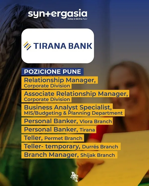
Because employer names arrive late and keep changing, every applied piece is a template with one variable field. Announcements, badges and social posts are all the same block redrawn at a different size — a fair-day system anyone on the team can extend without a designer in the room.

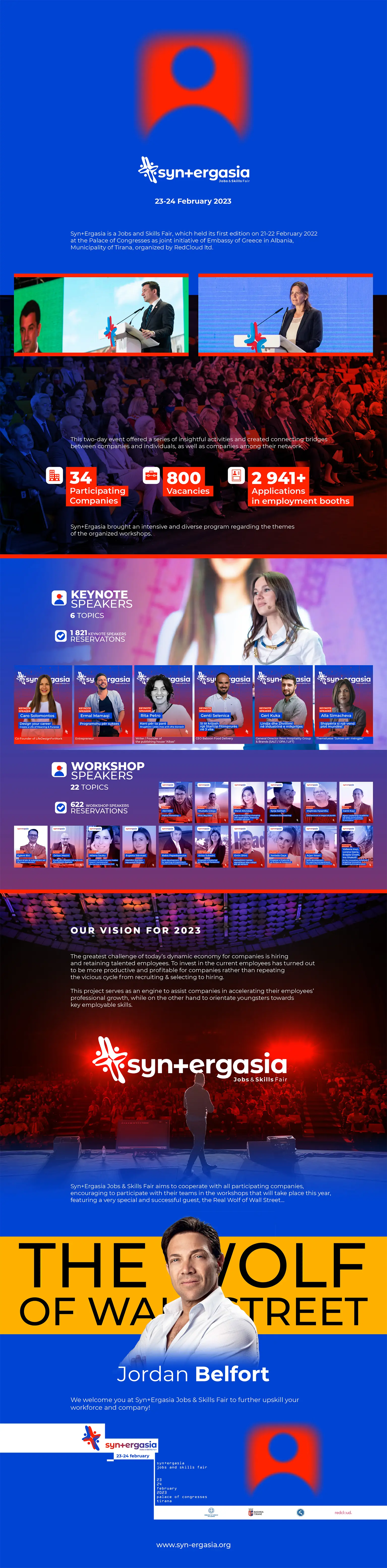
report 2022 — drag or click the page edge to turn



Let's make the next one.
design with guts — art with soul