next to vala mar premium — 2023

Next to Vala Mar Premium
Brand identity and a full guidelines book for a premium residential development on the Albanian coast — a mark, a type system, and the print and digital surfaces that carry it.
A window on the water, drawn once and used everywhere.
The mark is a frame around a sail and a wave — the view a resident buys, reduced to four strokes. Architecture, sea, window reflection and sailboat: each element is drawn to hold at envelope scale and at billboard scale without a second version.
Dark teal (#024D52) carries the whole system; a flared Roman serif keeps it closer to a hotel than to a listing. Everything below is one decision applied forty times.
Forty pages so nobody has to guess.
The guidelines book runs from narrative and value proposition through logo anatomy, exclusion zones, minimum sizes and misuse, into typography, colour, web palette, icons and favicon — then out to stationery, apparel and outdoor.
It was built to be handed to agencies, printers and the sales team at once: every rule has a page, every page has an example.
brand guidelines — drag or click the page edge to turn
type & colour
Three typefaces, one voice: inscription, editorial, plain.
Marcellus SC does the titling — flared Roman letterforms, wide tracking, the part of the brand that has to feel carved. Playfair Display takes secondary titles where a modern contrast is needed, and Montserrat carries body copy on every surface.
Colour is deliberately two values. Teal and pure white, with gradient filters as the only permitted intervention — the book documents four of them so photography never eats the logo.
01 — the mark
02 — stationery
applications
From an envelope to a bus stop without redrawing anything.
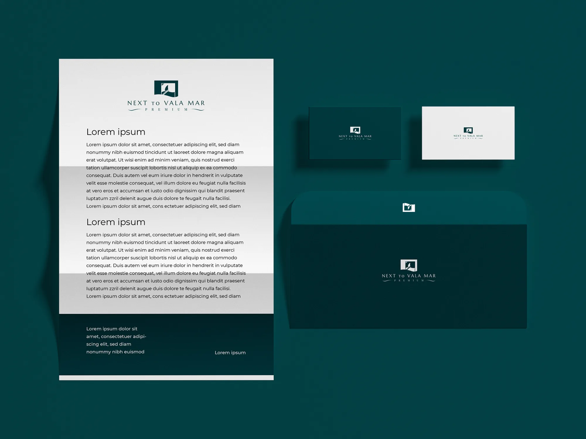
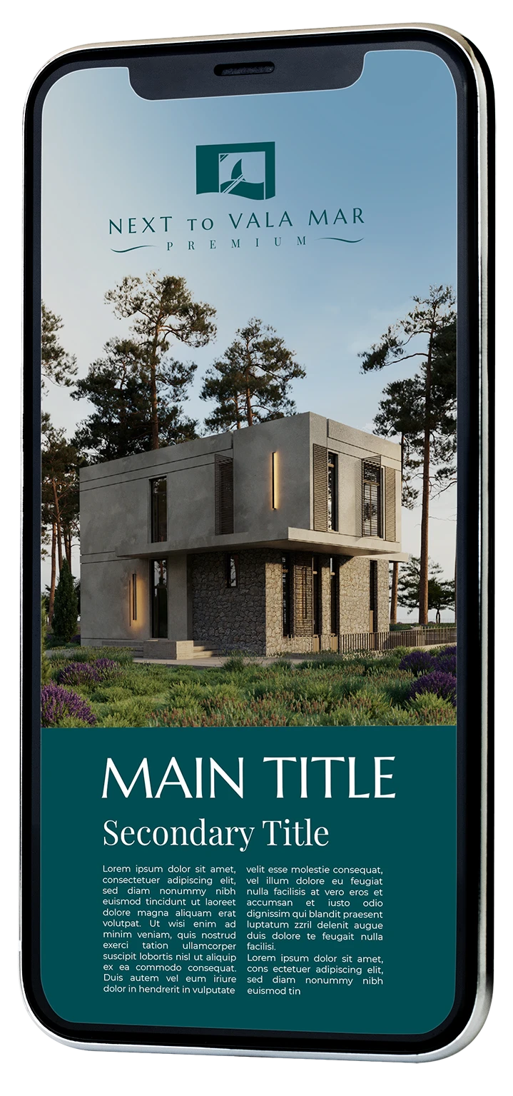
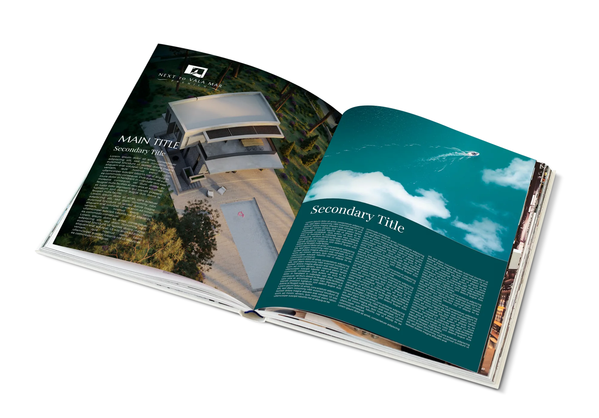
The same lockup, placement grid and two-colour rule produce the letterhead, the cards, the brochure spread, the mobile landing screen and the wide outdoor poster. Nothing is re-styled per medium; only the crop changes.
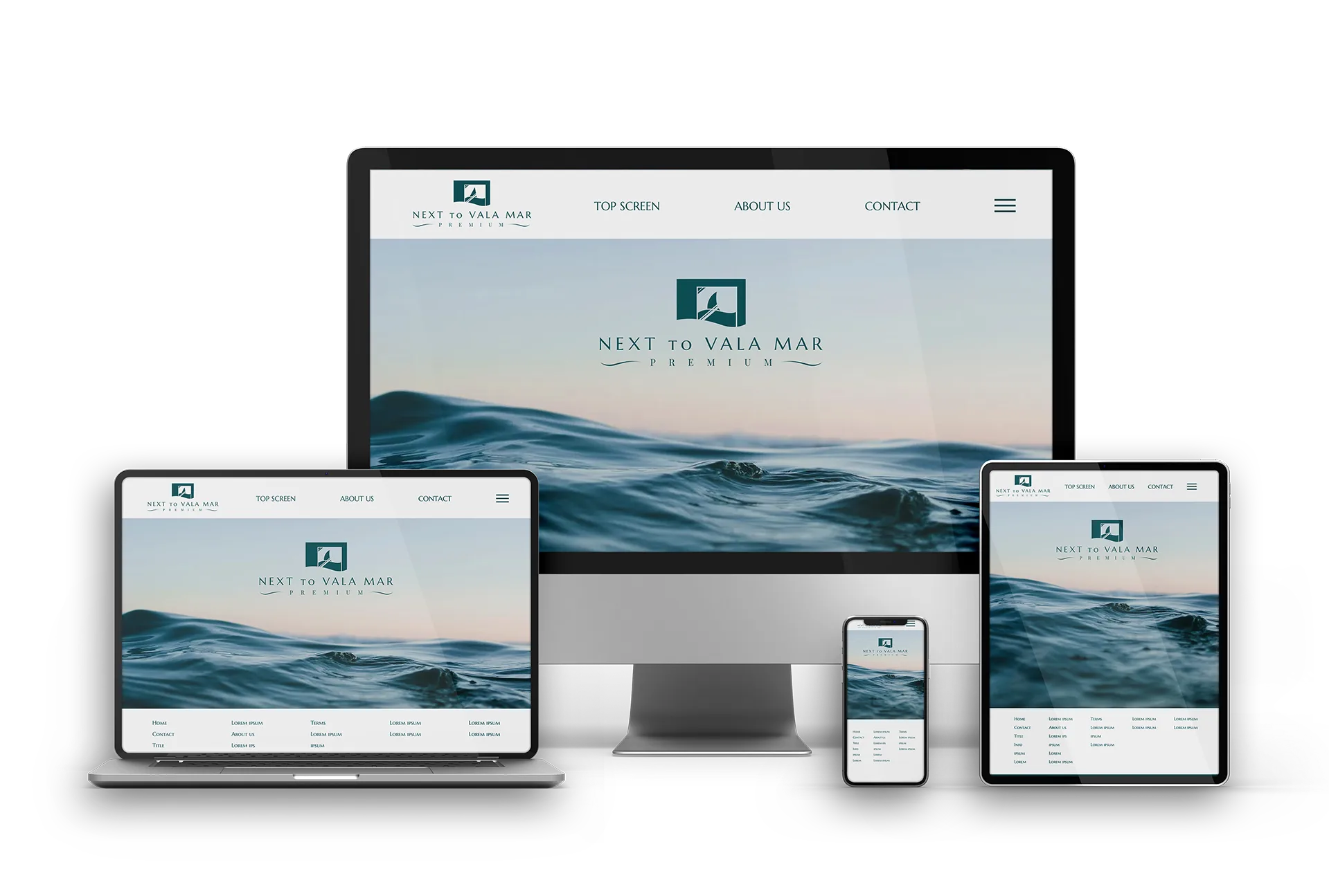
Web gets a documented light and dark palette so the site can invert the header without the logo losing its window.
03 — mobile
04 — brochure
05 — web
Let's make the next one.
design with guts — art with soul