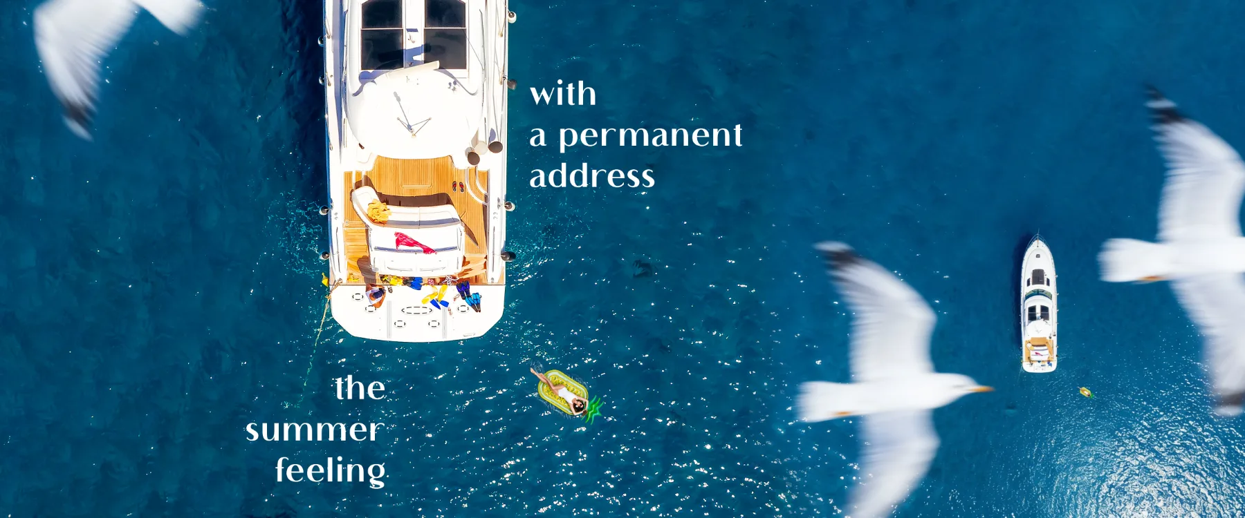
vlora marina — a year of campaigns, 2026
Campaigns, 2026.
A rolling year of advertising for Vlora Marina — separate campaigns for the purchase offer, the construction milestone, the summer season, the interiors, the brochure and the festival stage, all cut from one visual language.
Each campaign answers a different question. The brand answers all of them the same way.
Through 2026 the project sells in phases: an incentive to buy now, proof that it is being built, a season to imagine, rooms to move into, and a city to belong to. Every phase gets its own campaign and its own headline hierarchy — never a new look.
What holds it together is a fixed kit: deep navy and marina gold, one grid, one type pairing, and photography that always keeps the horizon in frame. The offer changes; the address stays recognisable in a feed, on a billboard, and on a festival stage.
Copy is written to survive cropping — headline first, benefit second, number last — so a single key visual can travel from a print spread to a 4:5 post without being redesigned.
campaign 01 — the offer
Buy the home. The holidays until handover are on us.
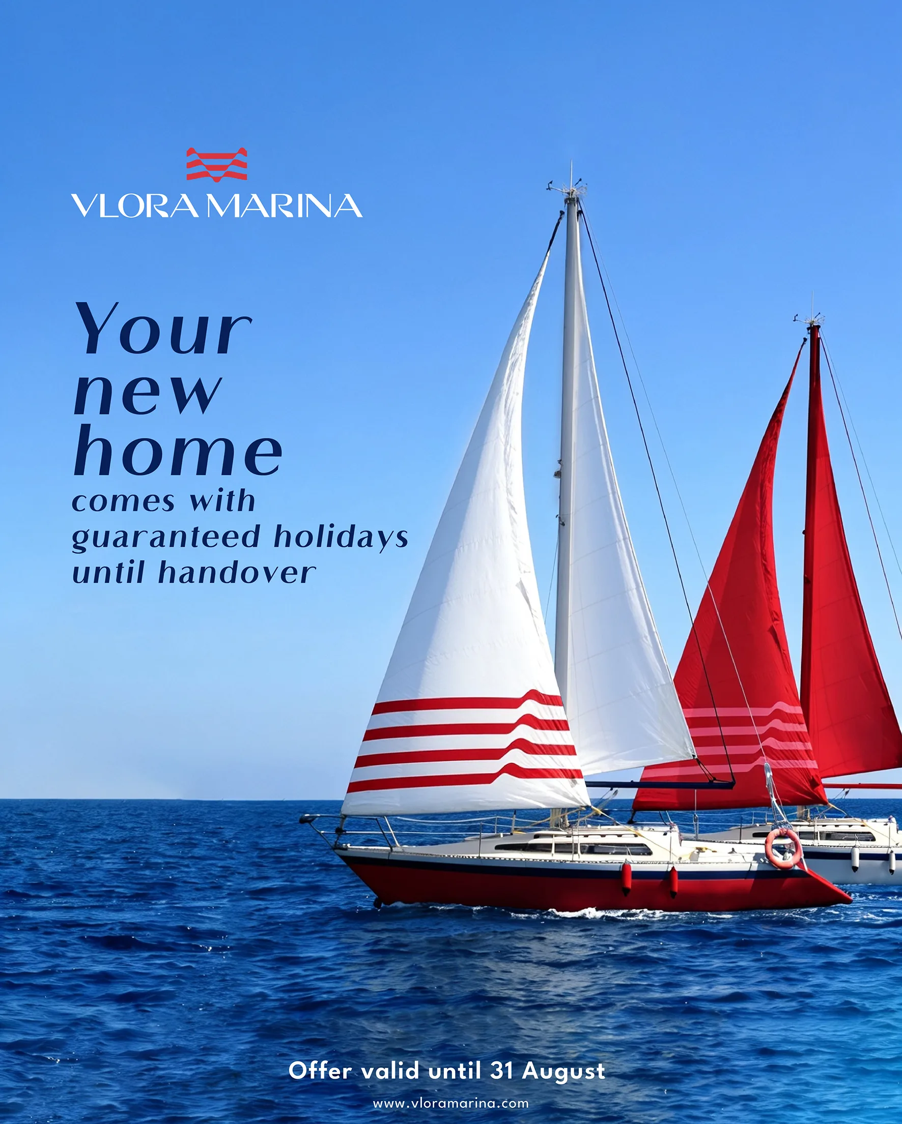

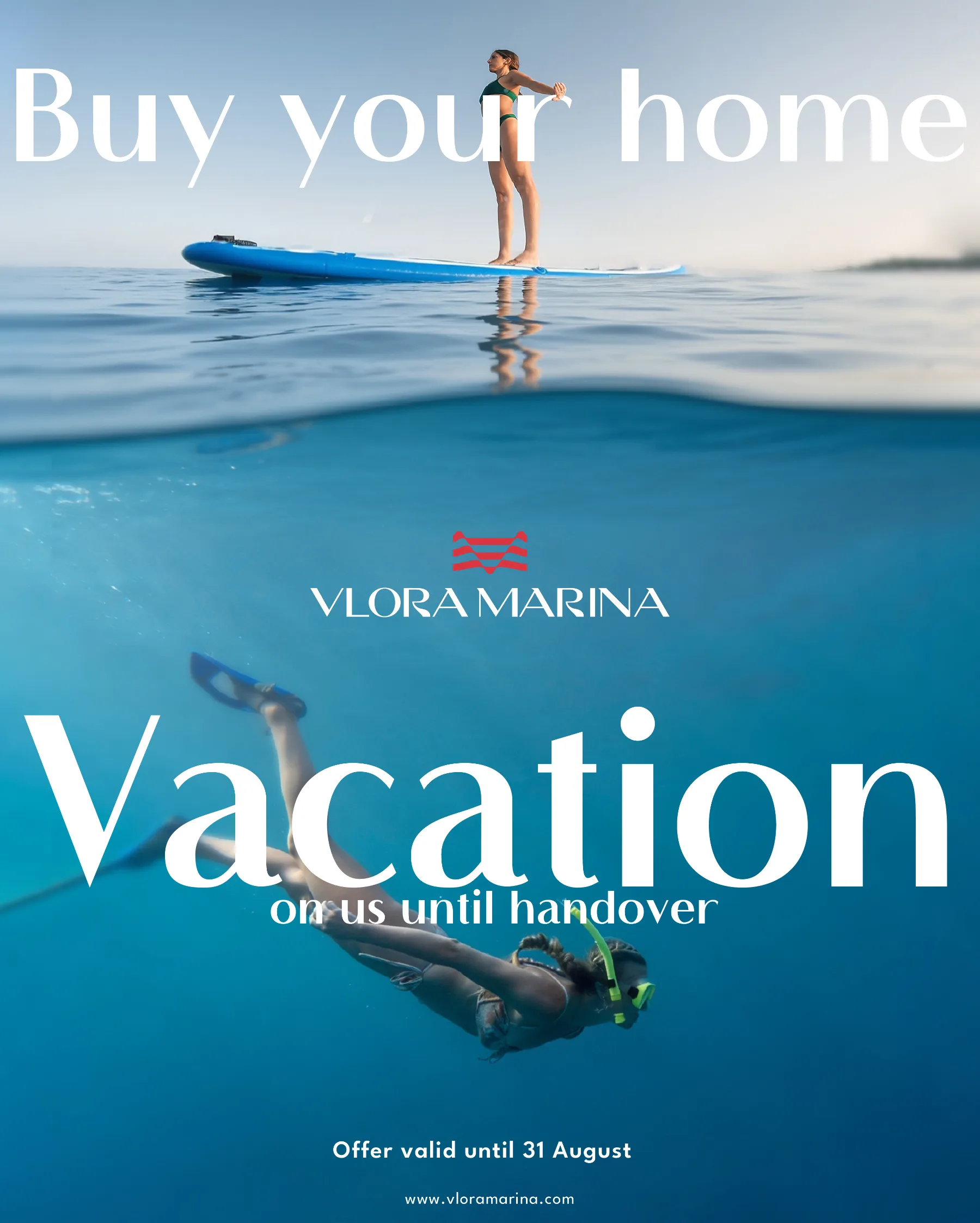
Three executions of one incentive, built so the reason to act is never buried: sails and open water do the persuading, the headline takes the first read, and the €10,000 figure lands last as confirmation rather than as a shout.

campaign 01 — the return, the run
One headline, three amounts of image.
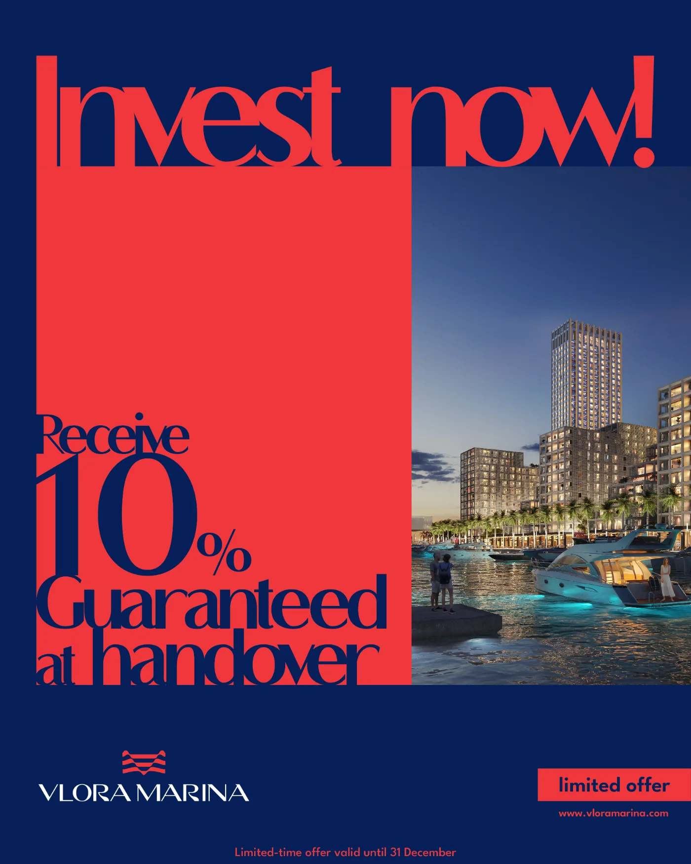
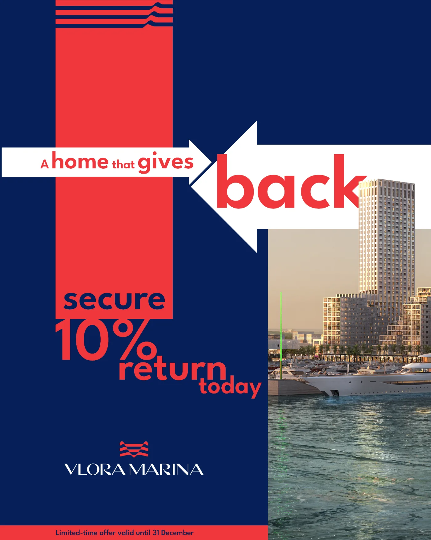
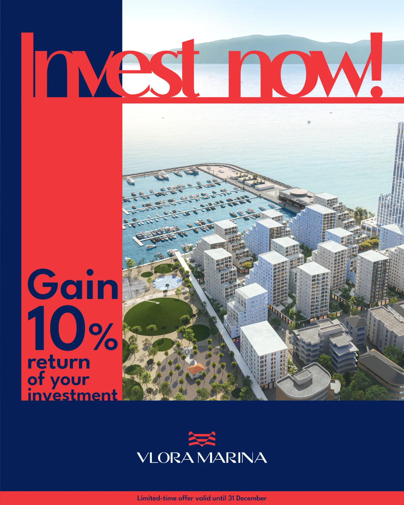
Same red block, same promise, three different quantities of render behind it — enough range to run the offer for a month without the feed repeating itself.
campaign 01 — the return, route a
The offer read from both ends.

The render stays untouched and the type does the turning: the promise at the top, the number mirrored underneath, so the sentence completes itself only when the whole frame is taken in.
campaign 01 — the return, route b
No render at all.
Two red panels on painted blue: the promise above the logo, the number below it. Nothing to look at but the words, which is exactly what a returning buyer needs from the fifth ad in a row.
campaign 01 — the return, route c
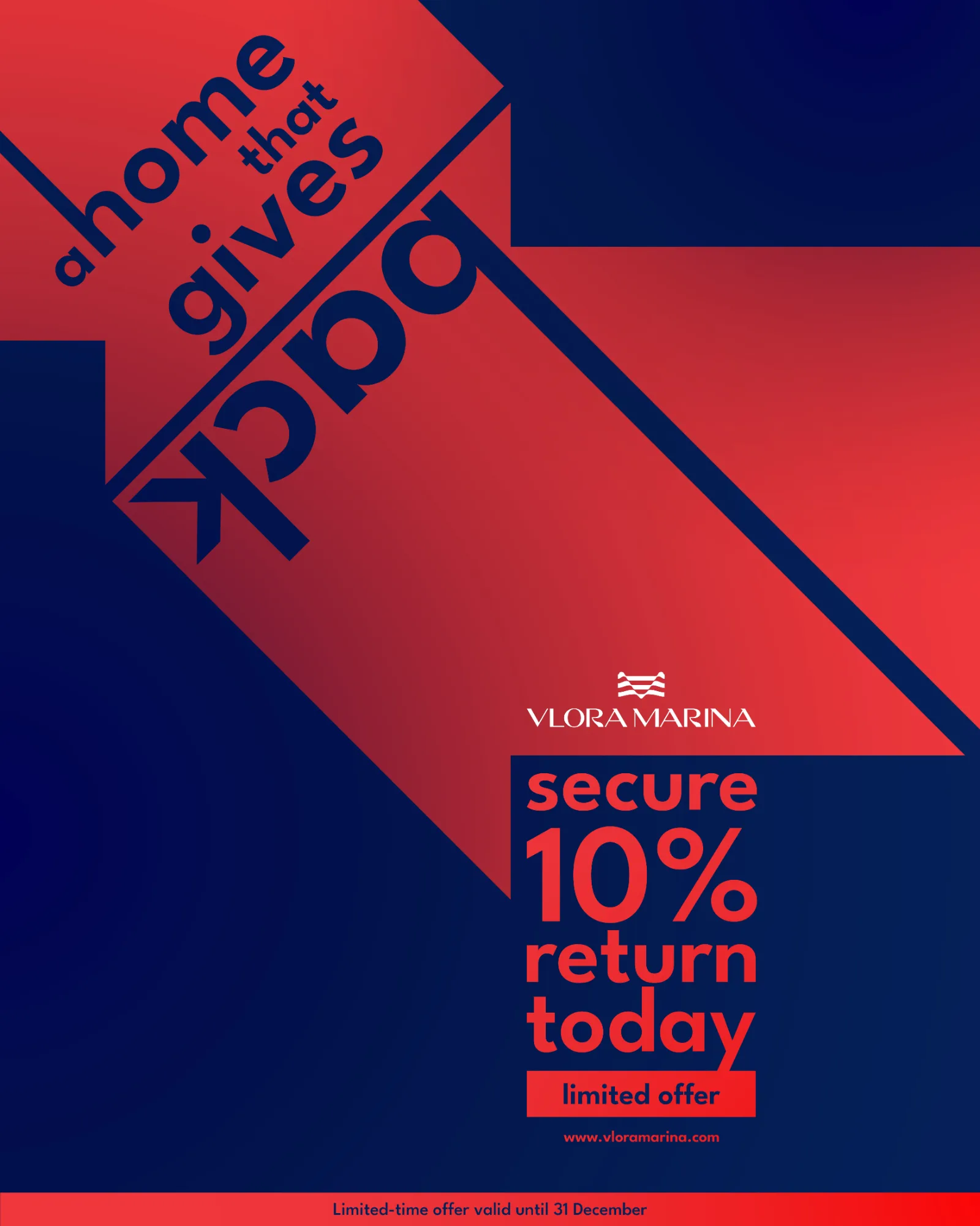
The diagonal that carries the word.

A single cut across the frame turns the headline into architecture — red falling into navy, the offer landing bottom-right where the eye stops. The loudest of the three, kept for launch week.
campaign 04 — the doorway
One frame, four views of the same sea.


A single classical doorway, repeated across the run, with the water spilling out of it onto the navy. Only what stands inside the frame changes — dusk over the marina, sails, the promenade, the tower at golden hour — so the set reads as one campaign long before the logo does the work.
campaign 02 — the milestone
Half drawing, half evening.
A single cut down the middle turns the construction story into the finished one — the render carries the promise, the sketch keeps it honest. It is the milestone campaign: proof of progress for buyers who are asked to commit before the keys exist.


campaign 03 — the season
Twelve frames, one waterfront.
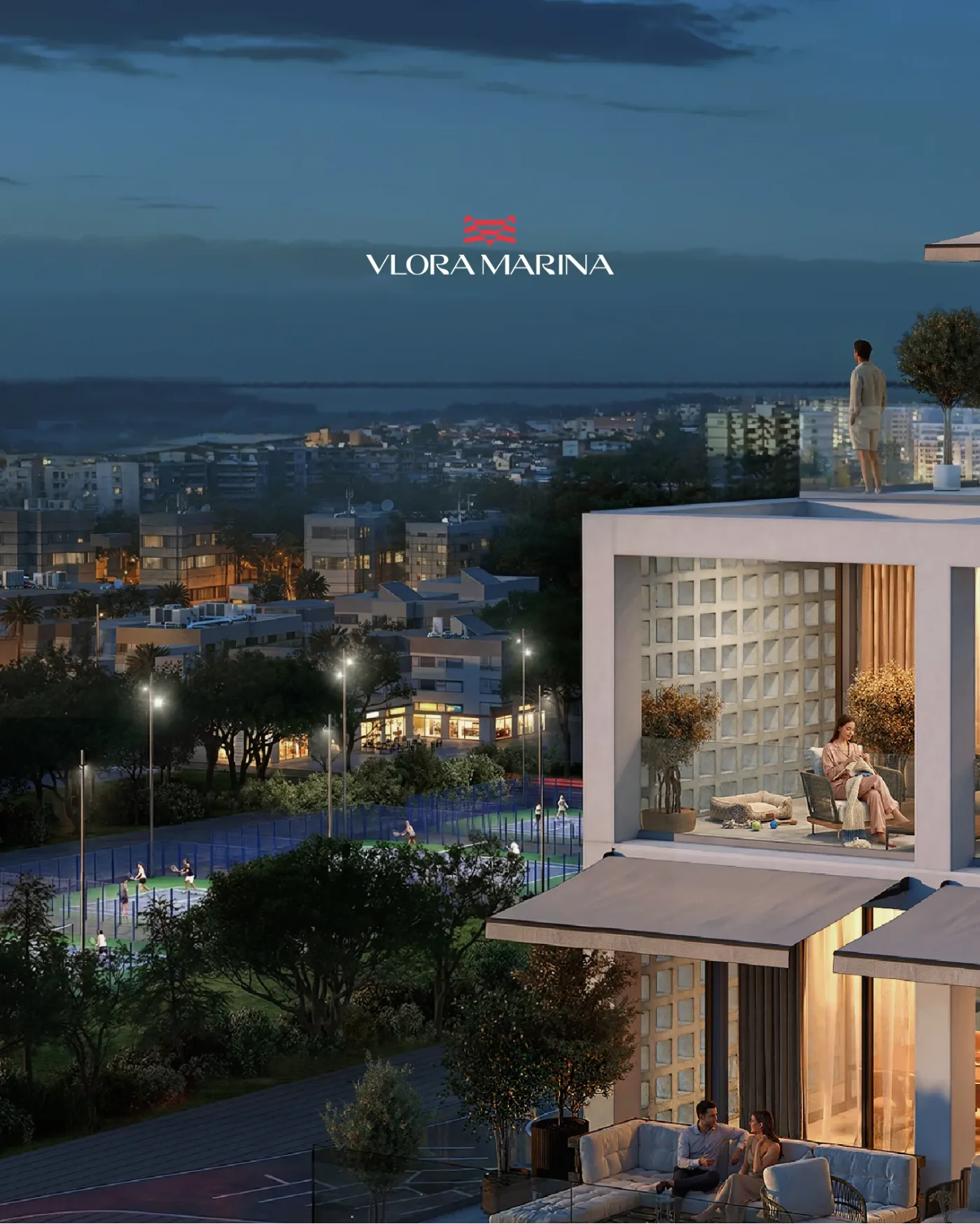


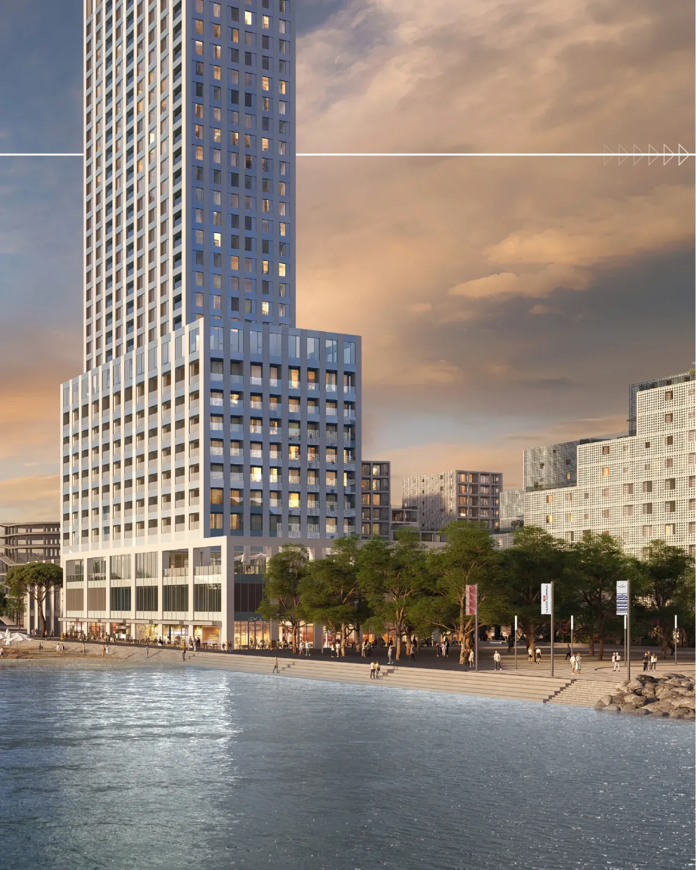

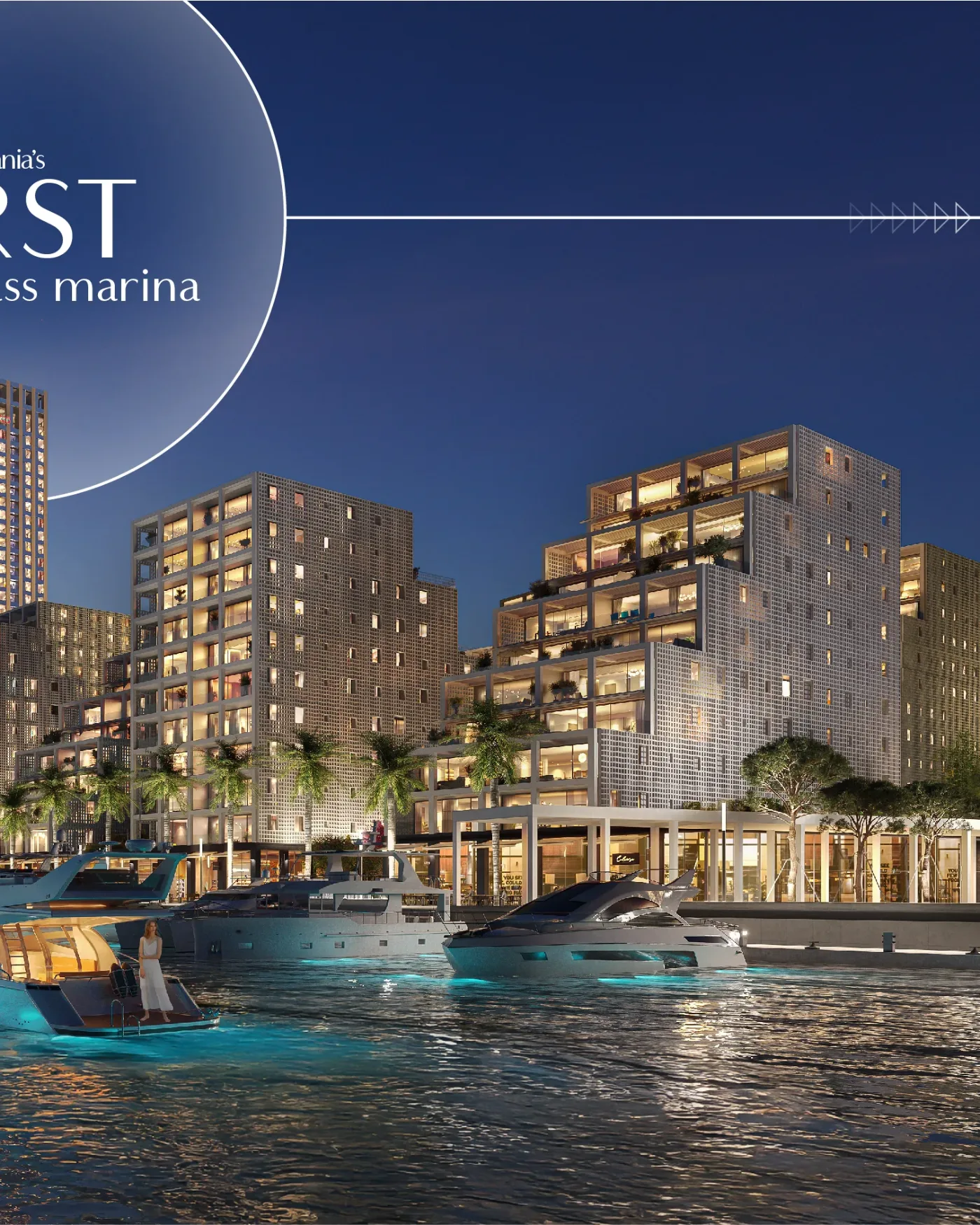


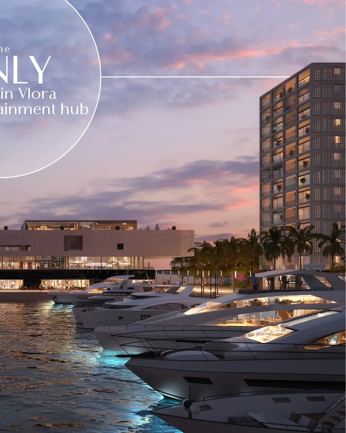
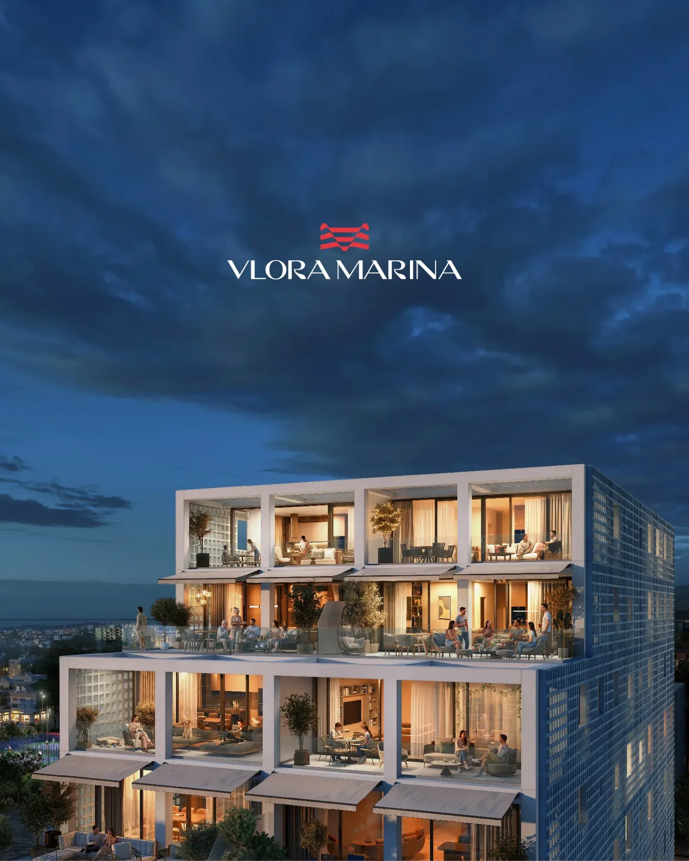
The summer run, drawn for the scroll: each frame is legible alone and gains a sentence when swiped, so the set works as a carousel, a story sequence, or twelve separate posts.
campaign 04 — the interiors
Inside the address.


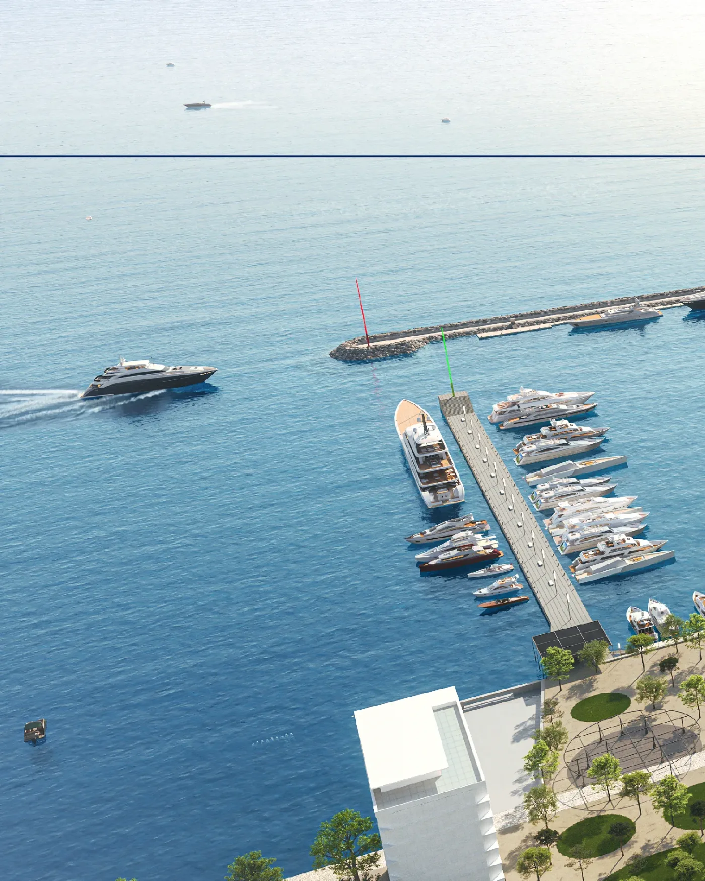
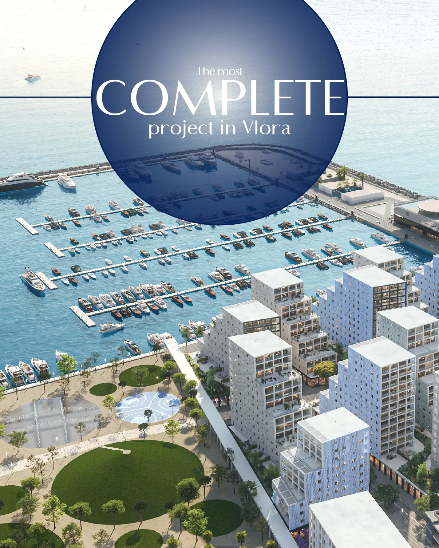
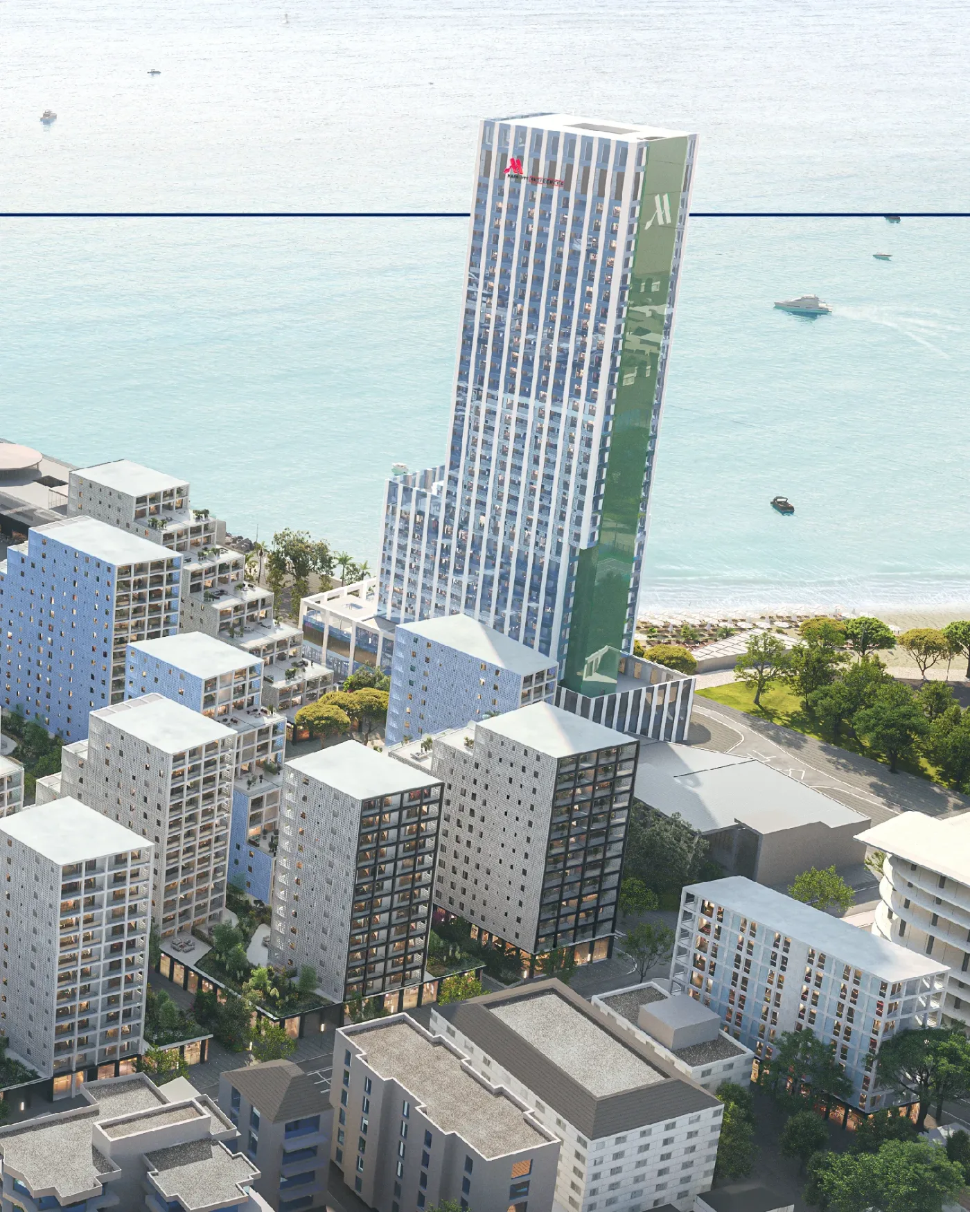


Second half of the year, the argument moves indoors — materials, light and layout at eye level, with the same type and colour discipline so the interiors read as the same brand seen from within.
campaign 05 — press
A spread that behaves like a window.
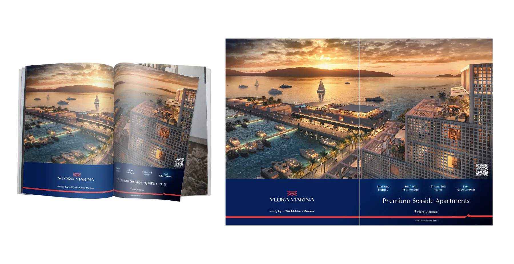
Built for magazine paper: image across the gutter, text held to one column, and enough quiet at the edges that the eye reaches the offer without being led there.
campaign 06 — the location
How close is close?
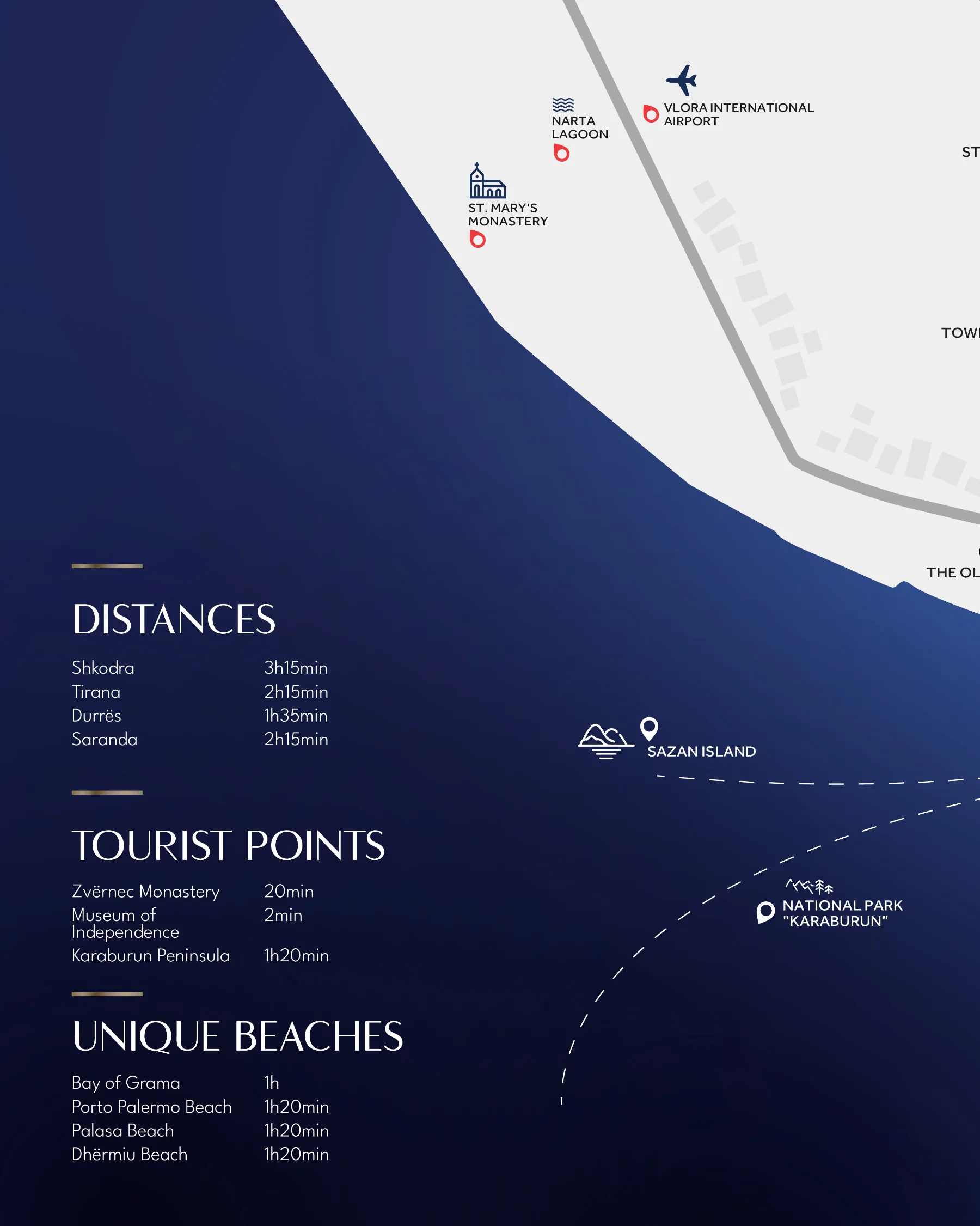
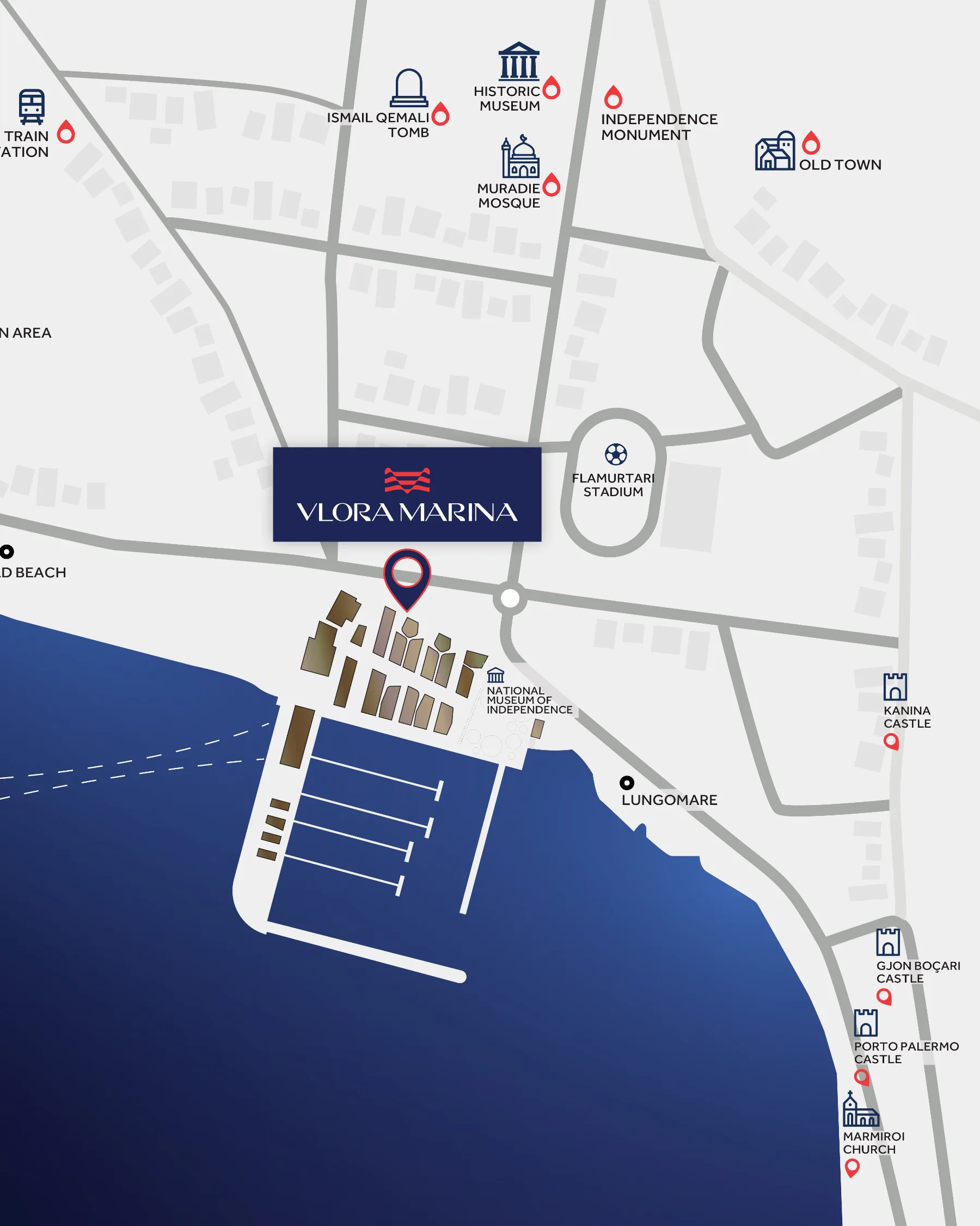

Three maps at three zooms — Europe by flight and by sea, the region by road, the city on foot — drawn in the brand palette so distance stops being an objection and becomes a selling point.
campaign 07 — film
campaign 08 — the brochure
Why Vlora Marina, in the order people ask it.
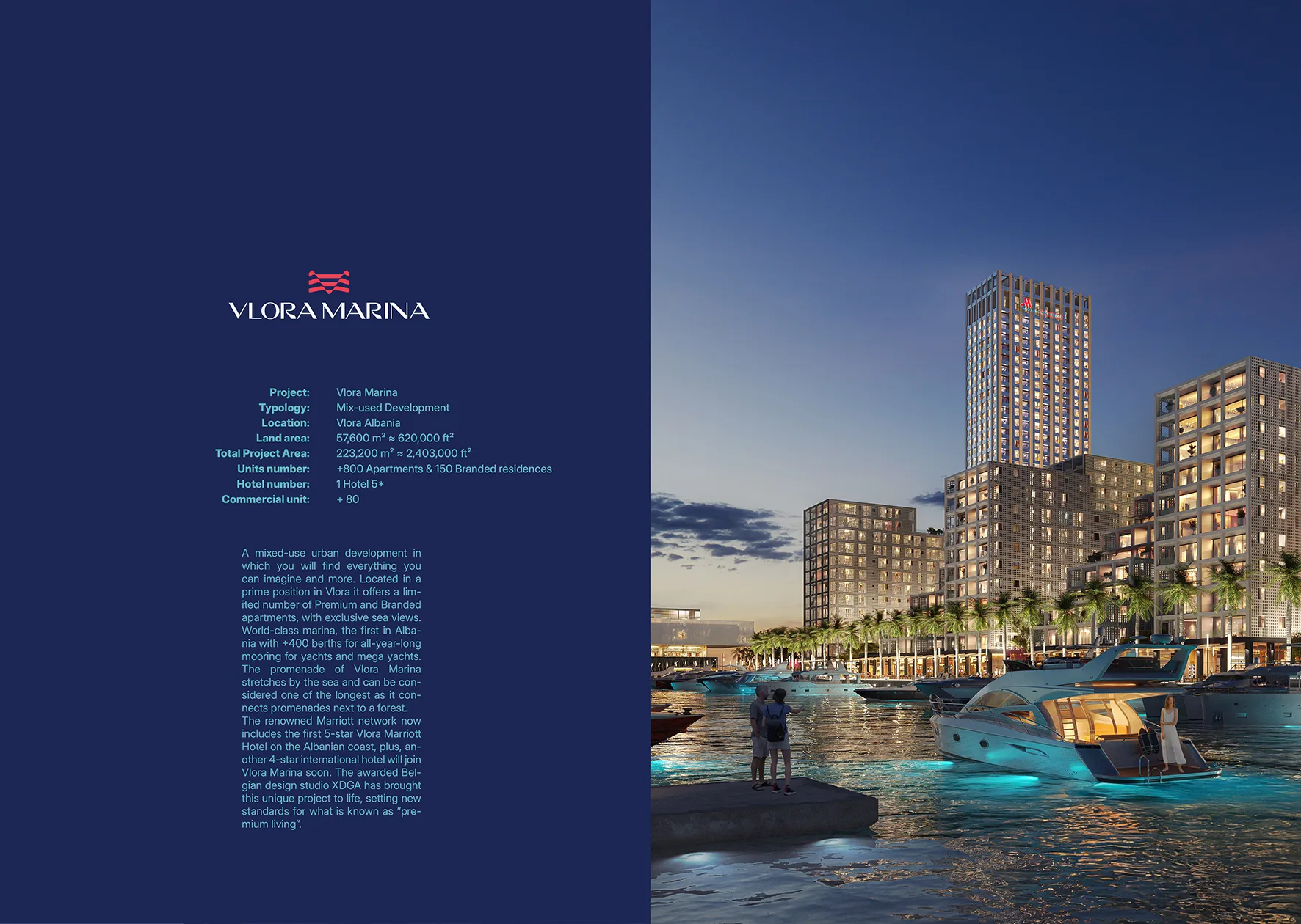
The sales document the whole year points to: every campaign above ends in a conversation, and this is what stays on the table afterwards.
campaign 08 — facts, without the sales voice

campaign 08 — the closing page

campaign 09 — film II
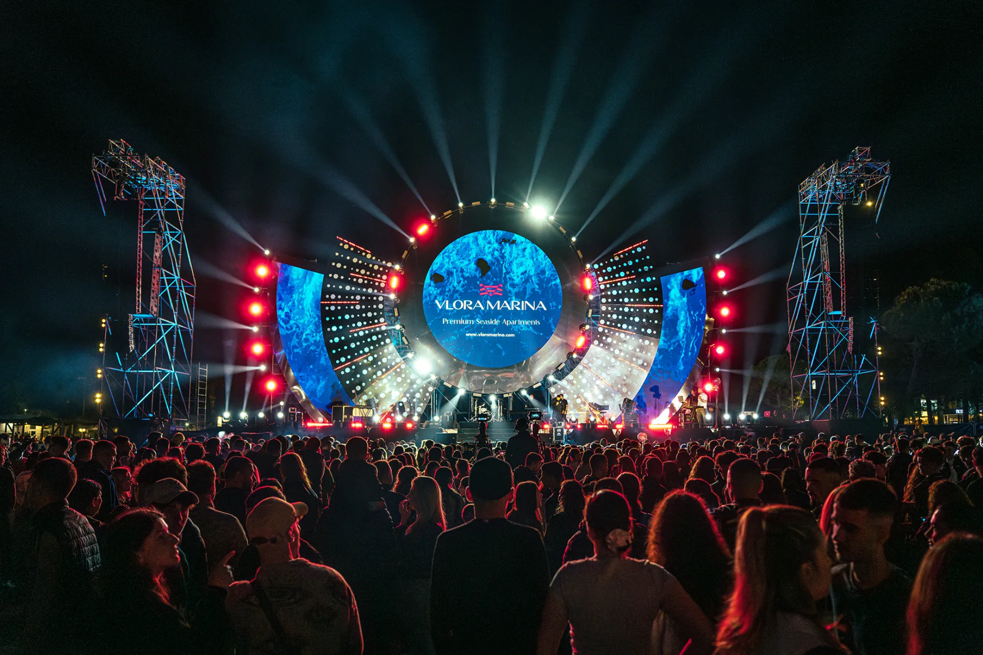
campaign 10 — the stage
The brand, at festival scale.
The year closes where the audience already is: a stage lit in brand colour, the name at architectural size, and no offer at all — presence doing the work advertising cannot.
Let's make the next one.
design with guts — art with soul